Mapping ZIP codes to Shapefiles in R with ggplot & ggiraph
#R #shapefiles #ggplotWhat do we want to achieve?
Say you have a dataset that includes the zip-codes for each observation. Now you want to display your observations on a map for each zip-code area. Imagine we conducted a survey in which we asked citizens of Germany about their current level of happiness (on a scale from 1 to 10). We also queried their ZIP-Code to be able to display the happiness level on the map. The survey results —when not considering metadata— contain three variables:
- Response ID (
id) - ZIP-Code (
zip) - Hapinsess Level (
happiness)
Packages we need:
library(sf)
library(tidyverse)
library(ggplot2)
library(ggiraph)
library(colorspace)
library(plotly)
Let’s load the dataset…
survey <- read.csv('happiness_germany.csv')
head(survey)
    zip  ID happiness                BL.Name
1 14532 112      6.40            Brandenburg
2 16837 330     10.00            Brandenburg
3 17495 593      6.40 Meckelnburg-Vorpommern
4 18196 500      3.70 Meckelnburg-Vorpommern
5 21228 565     10.00          Niedersachsen
6 21481 188      5.95     Schleswig-Holstein
Now we need to load the geographic data. For this we will use shapefiles. Shapefiles can be found online for free for either world maps or specific countries. In this case, I downloaded a shapefile for Germany. Shapefiles usually consists of different files, and for them to be readably by R they need to be within a folder. I called the folder shapefiles_germany. Within the folder, we can find the following files.
gadm36_DEU_1.cpggadm36_DEU_1.dbfgadm36_DEU_1.prjgadm36_DEU_1.shpgadm36_DEU_1.shx
Let’s load the shapefiles into R
shapefile <- sf::read_sf("shapefile_germany/")
Note that we are loading the complete folder and not only a single file!
Mapping ZIP-Code to states
Here we have a problem. The shapefile contains only state names and does not have any ZIP codes. Hence it will be difficult to map the ZIP-Codes to our shapefile. What the shapefiles do have however is the state names. So, what we need to look for, is a data table that maps ZIP codes to states. Luckily, that’s also something that can be found online pretty easily.
Let’s load the file which looks something like this:
mapping_zip_state <- read.csv('zip_code_mappings.csv')
str(mapping_zip_state)
'data.frame':   8180 obs. of  2 variables:
 $ PLZ_Zahl: int  1067 1069 1097 1099 1108 1109 1127 1129 1139 1156 ...
 $ BL.Name : chr  "Sachsen" "Sachsen" "Sachsen" "Sachsen" ..
Now we need to merge our happiness data and ZIP code mappings. First we only selected the variables we need:
- ZIP code (
PLZ_Zahl) - State name (
BL.Name)
Then we merge the two datasets with merge()
mapping_zip_state %>% select(PLZ_Zahl, BL.Name) -> mapping_zip_state
merge(survey, # left dataset
      mapping_zip_state, #right dataset
      by.x = "zip", #common variable in left dataset
      by.y = "PLZ_Zahl", #common variable in right dataset
      all.x = TRUE # type of join (here left join)
      ) -> survey
Before we continue, let’s drop the columns that contain NAs.
Be careful: d Here rows are only dropped for demonstrating purposes. On real data sets, you should have a strategy for handling missing values!
survey %>% drop_na() -> survey
Aggregating data
Before we can match our happiness scores to the shapefile, we need to aggregate the data per state. Here I will just compute the average happiness score for each German state. I am first grouping by state (BL.Name), then summarising.
survey %>% group_by(BL.Name) %>% summarise(happiness = mean(happiness)) -> happiness_scores
happiness_scores
I notice that 2 states are missing so I add them to the dataset.
happiness_scores <- rbind(happiness_scores, c("Bremen", NA), c("Hamburg", NA))
Matching to shapefile
Now I am ready to merge to the shapefile. Here you need to look through your shapefile and find the right matching variable. In my case this is NAME_1.
plot_data <- merge(shapefile, happiness_scores, by.x="NAME_1", by.y = "BL.Name", all.x=TRUE)
Plotting the map
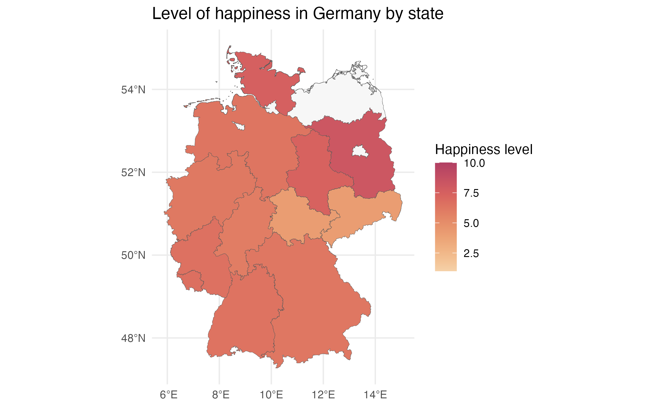
We are now ready to plot our first map with ggplot. For this we use our plot data plot_dataand pipe it into ggplot.
# plot data use intention
plot_data %>%
  ggplot +
  aes(fill=as.numeric(happiness)) + # Fill with color by score
  geom_sf(size=.1) + # Create the map from shapefile
  scale_fill_continuous_sequential(palette = "RedOr", begin= 0, end=1, limits=c(1,10), na.value = "grey 97")+ # Set fill color with the package 'colorspace'
  theme_minimal()+
  labs(fill="Happiness level", title = "Level of happiness in Germany by state") # Add some labels
The final map looks something like this:

Interactive Map
If you want to make the map interactive, try something like this:
plot_data$happiness <-  round(as.numeric(plot_data$happiness), 2)

# plot data use intention
plot_data %>%
  ggplot +
  aes(fill=as.numeric(happiness)) + # Fill with color by score
  geom_sf_interactive(size=.1, aes(tooltip=c(happiness))) + # Create the map from shapefile
  scale_fill_continuous_sequential(palette = "RedOr", begin= 0, end=1, limits=c(1,10), na.value = "grey 97")+ # Set fill color with the package 'colorspace'
  theme_minimal()+
  labs(fill="Happiness level", title = "Level of happiness in Germany by state") -> happiness_plot

ggiraph::girafe(
  ggobj = happiness_plot,
  width_svg = 10,
  height_svg = 6,
  options = list(
    opts_tooltip(opacity = .9, css = "background-color:gray;color:white;padding:2px;border-radius:2px;"),
    opts_hover(css = "fill: #00868B;"),
    opts_hover_inv(css = "opacity: 0.3;")
  )
)
The important bit here is geom_sf_interactive(size=.1, aes(tooltip=c(happiness))). This comment makes the shapefile interactive and allows you to add interactive tooltips. The ggiraph::girafe()command takes care of the styling.
Cheers!